Blog Tips | Site Map
Site Map. So, what is it? A site map is an organized list of pages on your site. The goal of a site map is to make it super easy for users (or crawlers) to easily navigate your website. In other words, making it really easy to find what they want.
Have you ever been on a website and couldn't find what you were looking for? What did you do? Personally, I move onto to the next website where I can find what I'm looking for! Therefore, site maps are far more important to the success of your blog than you think!
Okay, let's face it. We all want to think that looks don't matter and it's what's on the inside that counts. False. I am here to tell you that is just untrue. I like pretty things, don't you?
Now, there is also another component to all of this and that is we have expect a certain "look" or "feeling" from different types of sites. Blogs are expected to look a certain way, apparel retailers are supposed to look a certain way, financial website another way. And, so on. It's true. Pay attention to it the next time you're surfing the web. When you come across a site that doesn't meet those expectations, you're likely to high tail out of there!
I know what you're thinking, this can sound kind of shallow. But, folks. It's the truth. We can be shallow beings sometimes. Often, we like things sugar coated and sparkly! And you know what, there isn't anything wrong with that. Because, with a little creativity, you still can be uniquely you (within the confines of what is expected, of course.)
Every blogs site map will not look the same, but the layout should be similar. For example, for my blog, I want readers to know that I have an Etsy Shop. So, I try to draw attention to that on my sidebar, navi bar, and even on the top of my page. You might want readers to know about a blog series you're proud of, or a charity you support. See, we're all so unique! All jokes aside though, did you know readers spend nearly 3/4 of their time viewing the left side of a website. (read this article) Why, you ask. Simply because we read from left to right! Makes sense, no? Not only do I prefer the blog content to be on the left, it makes sense too. Test it out for yourself!
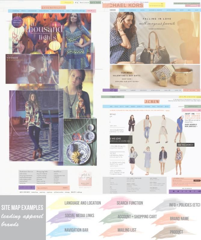
Still not convinced? Let me show you a few examples of leading Apparel Brands that do it great!
The site maps for these three leading women's apparel brands are nearly identical, However, and most importantly, they still possess their own style and feeling. The design of the website reflects the brand while still adhering to what is expected of an online apparel retailer. Anthropologie website is eclectic, warm, and very bohemian...Michael Kors site feels lux and sophisticated, and JCrew site reads crisp and clean. See. I told you so! If that doesn't convince you, then I don't know what will!
Leave me a comment and let me know if you like this post and would be interested in more like it. I'd appreciate some feedback! Thanks y'all! -Ruth-
Leave me a comment and let me know if you like this post and would be interested in more like it. I'd appreciate some feedback! Thanks y'all! -Ruth-


0 Comments:
Post a Comment
Subscribe to Post Comments [Atom]
<< Home